
 เพิ่มบทความใหม่


เครื่องมือที่ต้องใช้ทำเว็บด้วย Bootstrap เพื่อให้ทำงานได้อย่างรวดเร็ว
กำหนดวันที่เริ่มต้นของ Boostrap 4 DatePicker
$(".DateRightTranfer, .DateComReceiver").datepicker({
  format: "dd/mm/yyyy",
  autoclose: true,
  startDate: "+1d",
});

การทำเมนู Dropdown สำหรับ Bootstrap 4
.dropdown:hover .dropdown-menu {
    display: block;
    margin-top: 0; /*remove the gap so it doesn-t close*/
 }

การทำตัวแจ้งเตือน Notify ของ Bootstrap
วิธีใช้: showNotify(["success", "warning", "danger"], [หัวข้อ], [รายละเอียด ถ้ามี])

function showNotify(textType = "success", textTitle = "", textMessage = "") {
  $.notify(
    {
      title: textTitle,
      message: textMessage,
    },
    {
      type: textType,
      allow_dismiss: true,
      delay: 500,
      animate: {
        enter: "animated fadeInDown",
        exit: "animated fadeOutUp",
      },
      onShow: function () {
        this.css({ width: "auto", height: "auto" });
      },
    }
  );
}

การแสดงป็อปอัพ (Popover) ขณะ Mouse เลื่อนไปหาปุ่ม

Bootstrap 4 ให้เพิ่ม Bundle Source:
bootstrap.bundle.min.js1. แท็กและใส่ข้อความที่ต้องการแสดง
data-toggle="popover" data-content="[ข้อความที่ต้องการให้แสดง]"
2. ใส่แท็กไว้ใน Document Ready
$('[data-toggle="popover"]').popover();
3. ตัวเลือกเพิ่มเติม
3.1 โชว์ป็อปอัพขณะเม้าท์เลื่อนไปหาใชแท็ก
data-trigger="hover"
3.2 โชว์ป็อปอัพไว้ด้านบน
data-placement="top"
4. หากต้องการให้แสดงป็อปอัพเลยทันที
$("#popover").popover({ trigger: "hover" });
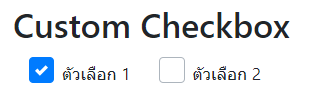
ทำ checkbox ให้ดูสวยงาม (ฺBoostrap Custom Checkbox)
div class="custom-control custom-checkbox custom-control-inline"
input type="checkbox" class="custom-control-input form-check-input"
label class="custom-control-label" ตัวเลือก 1
ทำงานหลังจากปิด เปิด Bootrap Modal แล้วสามารถ run Javascript คำสั่งต่อไปได้
//on show
$("#myModal").on("shown.bs.modal", function () {
    // do something…
});

//on hide
$("#myModal").on("hidden.bs.modal", function () {
  // do something…
});

Boostrap DatePicker กำหนดวันที่เริ่มต้นและวันที่สิ้นสุดแบบเรียงวัน มีข้อดีคือจะไฮไลด์ช่วงวันที่ให้ทราบ
ดาวโหลด Plug-in: https://eternicode.github.io/bootstrap-datepicker/

$(".input-daterange").datepicker({
  format: "dd/mm/yyyy",
  language: "th",
  todayBtn: "linked",
  autoclose: true,
});
Boostrap DatePicker กำหนดวันที่เริ่มต้นและวันที่สิ้นสุด(ตามเหตุการ changeDate คือขณะผู้ใช้คลิกเปลี่ยนวันที่)

$("#startdate")
  .datepicker({
    format: "dd/mm/yyyy",
    language: "th",
    todayBtn: "linked",
    autoclose: true,
  })
  .on("changeDate", function (selected) {
    var minDate = new Date(selected.date.valueOf());
    $("#enddate").datepicker("setStartDate", minDate);
  });

$("#enddate")
  .datepicker({
    format: "dd/mm/yyyy",
    language: "th",
  })
  .on("changeDate", function (selected) {
    var maxDate = new Date(selected.date.valueOf());
    $("#startdate").datepicker("setEndDate", maxDate);
  });
แก้ปัญหา Boostrap DateTimePicker ไอคอนลูกศรไม่แสดง ให้เราแทนที่ด้วยไอคอนฟรี จาก Fontawesome 4.7
ดาวโหลด Plug-in: https://getdatepicker.com/4/Installing/
let val_minDate = new Date();
val_minDate.setDate(val_minDate.getDate() - 1);

$("#input-DateVisit").datetimepicker({
  format: "DD/MM/YYYY",
  minDate: val_minDate,
  useCurrent: true,
  icons: {
    time: "fa fa-clock-o",
    date: "fa fa-calendar",
    up: "fa fa-chevron-up",
    down: "fa fa-chevron-down",
    previous: "fa fa-chevron-left",
    next: "fa fa-chevron-right",
    today: "fa fa-calendar-check-o",
    clear: "fa fa-trash-o",
    close: "fa fa-times-circle",
  },
});
การรับค่าเมื่อผู้ใช้เปลี่ยนวันที่
$("#deal-input-DateCreate").on("dp.change", function (e) {
  let valDateCreate = e.date.format("DD/MM/YYYY");

  console.log("objInput =>", valDateCreate);
});
สลับสี List Group

ul.list-group.list-group-striped li:nth-of-type(odd){
    background: #E5E5E5;
}
ul.list-group.list-group-striped li:nth-of-type(even){
    background: white;
}
ul.list-group.list-group-hover li:hover{
    background: #FFFDDA;
}
ทำ Custom Select ให้สวยงาม ด้วย Bootstrap 4

ส่วนของ Style มีดังนี้
.border-red {
	border: 1px solid #FF0000;
}

/*the container must be positioned relative:*/
.custom-select {
	position: relative;
	font-family: Tahoma, "sans-serif", Arial;
	padding: initial;
}

.custom-select {
    display: inline-block;
    width: 100%;
    height: auto;
    padding: initial;
    font-size: 1rem;
    font-weight: 400;
    line-height: 1.5;
    color: #495057;
    vertical-align: middle;
    background: #fff url("data:image/svg+xml,%3csvg xmlns='http://www.w3.org/2000/svg' width='4' height='5' viewBox='0 0 4 5'%3e%3cpath fill='%23343a40' d='M2 0L0 2h4zm0 5L0 3h4z'/%3e%3c/svg%3e) no-repeat right .75rem center/8px 10px");
    border: initial;
    border-radius: .25rem;
    -webkit-appearance: none;
    -moz-appearance: none;
    appearance: none;
}

.custom-select select {
	display: none; /*hide original SELECT element:*/
}
/*style the arrow inside the select element:*/
.custom-select .select-selected:after {
	position: absolute;
	content: "";
	top: 14px;
	right: 10px;
	width: 0;
	height: 0;
	border: 6px solid transparent;
	border-color: #f00 transparent transparent transparent
}
/*point the arrow upwards when the select box is open (active):*/
.custom-select .select-selected.select-arrow-active:after {
	border-color: transparent transparent #f00 transparent;
	top: 7px;
}
.custom-select .select-selected.select-arrow-active {
	border: 1px solid #FF0000;
}
/*style the items (options), including the selected item:*/
.custom-select .select-items div {
	color: #333333;
	padding: 8px 16px;
	cursor: pointer;
	user-select: none;
	border: 1px solid #e2e2e2;
	-webkit-box-shadow: 1px -1px 4px 0px rgba(0,0,0,0.07);
	-moz-box-shadow: 1px -1px 4px 0px rgba(0,0,0,0.07);
	box-shadow: 1px -1px 4px 0px rgb(0,0,0,0.07);
}

.custom-select .select-selected {
	color: #333333;
	padding: 8px 16px;
	cursor: pointer;
	user-select: none;
	background-color: white;
	border-radius: 5px;
	border: 1px solid #FF0000;
	font-size: 0.85em;
}

/*style items (options):*/
.custom-select .select-items {
	position: absolute;
	background-color: white;
	top: 100%;
	left: 0;
	right: 0;
	z-index: 99;
	font-size: 0.85em;
}
/*hide the items when the select box is closed:*/
.custom-select .select-hide {
	display: none;
}
.custom-select .select-items div:hover, .same-as-selected {
	background-color: rgba(0, 0, 0, 0.1);
}
.custom-select .select-box-shadow {
	-webkit-box-shadow: 10px 10px 5px -7px rgba(0,0,0,0.45);
	-moz-box-shadow: 10px 10px 5px -7px rgba(0,0,0,0.45);
	box-shadow: 10px 10px 5px -7px rgba(0,0,0,0.45);
}
ส่วนของ Javascript มีดังนี้
var x, i, j, l, ll, selElmnt, a, b, c;
/*look for any elements with the class "custom-select":*/
x = document.getElementsByClassName("custom-select");
l = x.length;
for (i = 0; i < l; i++) {
  selElmnt = x[ i ].getElementsByTagName("select")[0];
  ll = selElmnt.length;
  /*for each element, create a new DIV that will act as the selected item:*/
  a = document.createElement("DIV");
  a.setAttribute("class", "select-selected");
  a.innerHTML = selElmnt.options[selElmnt.selectedIndex].innerHTML;
  x[ i ].appendChild(a);
  /*for each element, create a new DIV that will contain the option list:*/
  b = document.createElement("DIV");
  b.setAttribute("class", "select-items select-hide");
  for (j = 1; j < ll; j++) {
    /*for each option in the original select element,
    create a new DIV that will act as an option item:*/
    c = document.createElement("DIV");
    c.innerHTML = selElmnt.options[j].innerHTML;
    c.addEventListener("click", function(e) {
        /*when an item is clicked, update the original select box,
        and the selected item:*/
        var y, i, k, s, h, sl, yl;
        s = this.parentNode.parentNode.getElementsByTagName("select")[0];
        sl = s.length;
        h = this.parentNode.previousSibling;
        for (i = 0; i < sl; i++) {
          if (s.options[ i ].innerHTML == this.innerHTML) {
            s.selectedIndex = i;
            h.innerHTML = this.innerHTML;
            y = this.parentNode.getElementsByClassName("same-as-selected");
            yl = y.length;
            for (k = 0; k < yl; k++) {
              y[k].removeAttribute("class");
            }
            this.setAttribute("class", "same-as-selected");
            break;
          }
        }
        h.click();
    });
    b.appendChild(c);
  }
  x[ i ].appendChild(b);
  a.addEventListener("click", function(e) {
      /*when the select box is clicked, close any other select boxes,
      and open/close the current select box:*/
      e.stopPropagation();
      closeAllSelect(this);
      this.nextSibling.classList.toggle("select-hide");
      this.classList.toggle("select-arrow-active");
    });
}
function closeAllSelect(elmnt) {
  /*a function that will close all select boxes in the document,
  except the current select box:*/
  var x, y, i, xl, yl, arrNo = [];
  x = document.getElementsByClassName("select-items");
  y = document.getElementsByClassName("select-selected");
  xl = x.length;
  yl = y.length;
  for (i = 0; i < yl; i++) {
    if (elmnt == y[ i ]) {
      arrNo.push(i)
    } else {
      y[ i ].classList.remove("select-arrow-active");
    }
  }
  for (i = 0; i < xl; i++) {
    if (arrNo.indexOf(i)) {
      x[ i ].classList.add("select-hide");
    }
  }
}
function setCustomSelectVal( id, val) {
	let $this = $("#"+id);
	//set
	$this.val(val);
	//get
	let $selected = $( "#"+id+' [value="'+val+'"]' );
	//get
	let textLabel = $selected.text();
	//show text
	let $parentDiv = $this.closest("div.custom-select");
	$parentDiv.find("div.select-selected").text(textLabel);
	//set active
	$.each($parentDiv.find("div.select-items div"), function( index, value ) {
			let $this = $(this);
  		let text = $this.text();
			if( text==textLabel ){
					$this
						.removeClass( "same-as-selected" )
						.addClass( "same-as-selected" )
						;
				 return false;
				 }
		});
	}//func

/*if the user clicks anywhere outside the select box,
then close all select boxes:*/
document.addEventListener("click", closeAllSelect);
ทำ Big Radio and Checkbox ให้มีขนาดใหญ่และสวยงามได้ทันที ด้วย Bootstrap 4
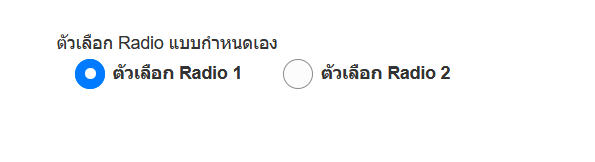
.custom-radio .custom-control-label::before {
    /* Radio=50, Checkbox=0 */
    border-radius: 50%;
}

 /*Big Radio*/
.custom-control-label::after {
        position: absolute;
        top: .25rem;
        left: 0;
        display: block;
        width: 24px;
        height: 24px;
        content: "";
        background-repeat: no-repeat;
        background-position: center center;
        background-size: 50% 50%;
    }

.custom-control-label::before {
        position: absolute;
        top: .25rem;
        left: 0;
        display: block;
        width: 24px;
        height: 24px;
        pointer-events: none;
        content: "";
        -webkit-user-select: none;
        -moz-user-select: none;
        -ms-user-select: none;
        user-select: none;
        background-color: #fcfcfc;
        border: 1px solid #8d8d8d;
    }
Bootstrap Notify ขึ้นป็อปอัพแจ้งผู้ใช้ทราบเมื่อโปรแกรมทำงานเสร็จแล้ว
http://bootstrap-notify.remabledesigns.com/
// แสดงข้อความ
$.notify('ข้อความ เสร็จแล้ว', {
    type: 'success',
    allow_dismiss: true,
    showProgressbar: false
});

// แสดงข้อความ 3 วินาทีแล้วปิดอัตโนมัติ
setTimeout(function () {
    $.notifyClose();
}, 3000);
ตัวอย่าง Bootstrap Notify

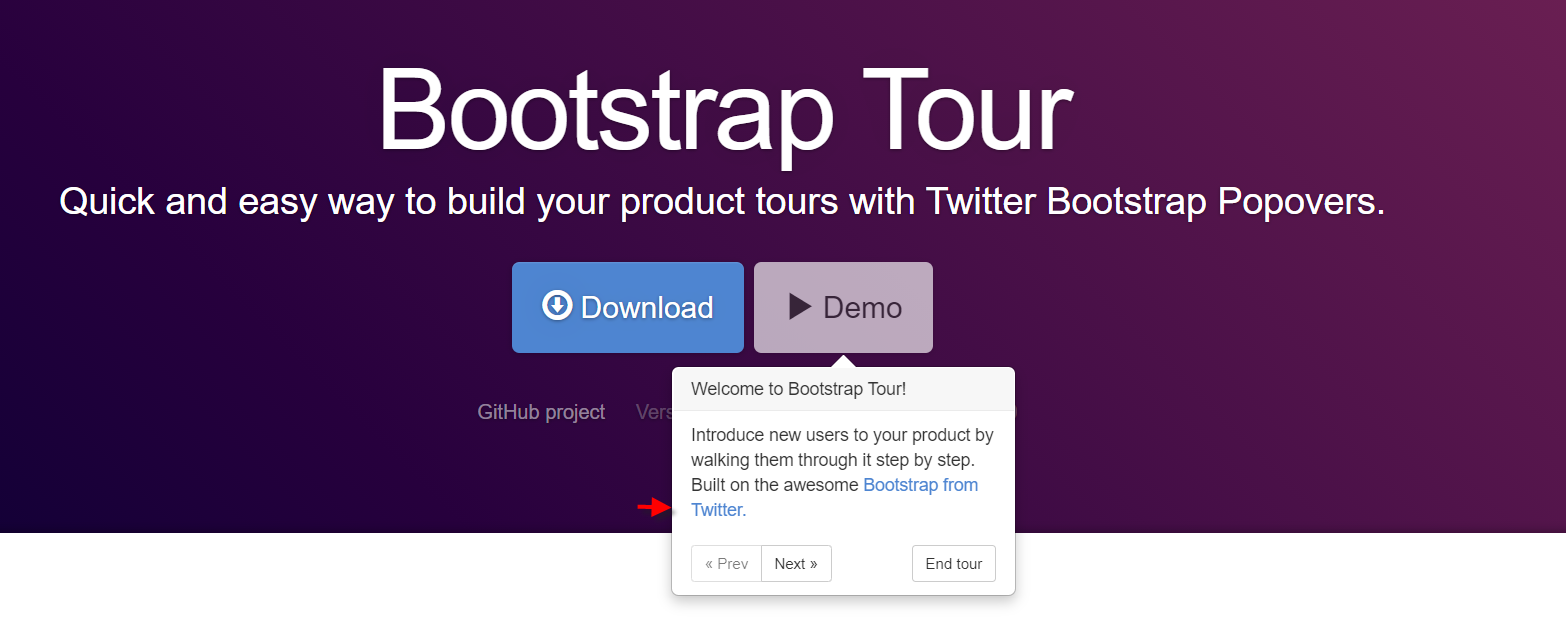
Bootstrap Tour แนะนำเครื่องมือต่าง ๆ บนเว็บให้ผู้ใช้ทราบ
http://www.sonisatima.org/analyst/assets/bower_components/bootstrap-tour/docs/index.html
ตัวอย่าง Bootstrap Tour
Bootstrap 4 จัดรูปแบบเมนูสำเร็จรูปยอดนิยม
แนะนำเว็บแรกจากเว็บ w3schools เช่น สไลด์รูปภาพ เมนู ปุ่ม
เว็บสอง tutorialrepublic เป็น Snippets สำเร็จรูปพร้อมใช้
ตัวอย่าง Bootstrap Snippets

Bootstrap Select Picker เสริมความสามารถให้ Select Box มีช่องค้นหา
== เลือกหลายรายการ
$('#myselect').selectpicker();
$('#myselect').selectpicker('val', [1,3,4]);
โหลดอัตโนมัติด้วย class พร้อมช่องค้นหา
select class="selectpicker" data-live-search="true"ตัวอย่าง
== รับค่าตอนผู้ใช้เลือก
  $('#selectpicker').selectpicker({
      liveSearch: true,
      maxOptions: 1
      })
      .on('change', function(e){
    //ใช้ได้ทั้ง 3 อย่าง
      console.log(
                this.value,
                this.options[this.selectedIndex].value,
                $(this).find("option:selected").val()
              );
      })
      ;
ปรับ Boostrap-Select ให้ดูสวยงาม
.bootstrap-select > .dropdown-toggle.bs-placeholder, .bootstrap-select > .dropdown-toggle.bs-placeholder:active, .bootstrap-select > .dropdown-toggle.bs-placeholder:focus, .bootstrap-select > .dropdown-toggle.bs-placeholder:hover {
	color: #515151;
	background-color: #e3e9ee;
	border-color: #d3d9df;
	-webkit-box-shadow: 10px 10px 5px -7px rgba(0,0,0,0.45);
	-moz-box-shadow: 10px 10px 5px -7px rgba(0,0,0,0.45);
	box-shadow: 7px 7px 5px -7px rgba(0,0,0,0.45);
	font-weight: 500;
}
.bootstrap-select > .dropdown-toggle {
	color: #515151;
	background-color: #e3e9ee;
	border-color: #d3d9df;
	-webkit-box-shadow: 10px 10px 5px -7px rgba(0,0,0,0.45);
	-moz-box-shadow: 10px 10px 5px -7px rgba(0,0,0,0.45);
	box-shadow: 7px 7px 5px -7px rgba(0,0,0,0.45);
}
.bootstrap-select .dropdown-toggle .filter-option {
	padding: 3px;
}
.bootstrap-select >
.dropdown-toggle.bs-placeholder, .bootstrap-select >
.dropdown-toggle.bs-placeholder:active, .bootstrap-select >
.dropdown-toggle.bs-placeholder:focus, .bootstrap-select >
.dropdown-toggle.bs-placeholder:hover {
	color: #999;
	border: 1px solid #d5d5d5;
}


กำหนดความกว้าง เช่น 500px
.bootstrap-select {
  max-width: 500px;
}
.bootstrap-select .dropdown-toggle {
  background-color: #e7e7e7;
}
.bootstrap-select .dropdown-menu {
  max-width: 500px;
  overflow: hidden;
}
.bootstrap-select .btn {
  padding: 10px 10px;
}
== javascript ให้ selectpicker อัพเดตข้อมูล
$("#selectpicker").selectpicker('refresh');
== แก้ปัญหา Boostrap Selectpicker เมนูถูกทับ
1. ครอบด้วย class: input-group
< div class="input-group first">< select id="selectpicker" data-live-search="true">< option>

2. กำหนด z-index ดังนี้
.input-group.first {
z-index: 10;
}
อ่านเพิ่มเติม: https://developer.snapappointments.com/bootstrap-select/
ตัวอย่าง


